
In this tutorial, I will describe the process of creating a shrinking sticky header in Elementor Pro. This will be done without additional plugins and container technology is used – not the outdated technique with Elementor sections.
Only two basic transformations that occur during scrolling are covered here: shrinking the logo and reducing the overall height of the header. These are also two transformations that are always needed when you want to make a Shrinking Sticky Header. Other possible transformations: changing the background color, adding a shadow on the border, changing the menu font size… can be added as needed, by using the same principle explained here.
Note: To follow this guide, you must have Elementor Pro installed and activated on your WordPress site. However, its application does not require any other plugin or WP theme with special features. To adapt the code to the needs of your site, you should have basic knowledge of CSS.
The technique presented here was created out of necessity. The agency for which I, as a subcontractor, occasionally create sites according to their design, believes that the plugin I previously used for this – Sticky Header Effects for Elementor – creates transformations that are not enough smooth. On the other hand, the instructions that deal with this topic on the official Elementor blog are complicated, rather confusing, and not entirely correct in the subsequently added section with containers. The latter probably has something to do with the fact that the aforementioned tutorial was created at a time when sections were the basis on which Elementor sites were built, and containers were just emerging as the future – at the time of writing, they were in one of their Beta releases.
As you will soon see, the CSS code from this tutorial is simple, without redundant use of variables, and easy to use and customize. It is fully responsive and involves separate treatment of the three basic screen sizes (desktop, tablet, and mobile phone). It is also completely independent of the WP theme and its implementation is tied exclusively to the custom code input capabilities offered by Elementor Pro. Custom JS code has also been used, which will also not cause you a problem: you should apply it exactly as it is given, without any changes.
I First, create a standard header and stick it to the top
In a way, this is understood as a necessary first step in the work, and I will give a few special notes that you should follow.
Put the entire header, in the part that will be sticky and shrink when scrolling, in one container. Give that container a CSS class of your choice (Edit Container > Advanced > Layout > CSS Classes) – I’ll use the “sticky-header” CSS class in this tutorial.
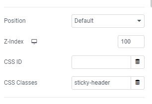
Also, do not specify the minimum height of the container, i.e. leave the field Edit Container > Layout > Container > Min height empty.
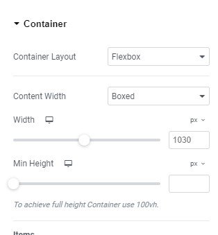
Padding top and bottom should also be left blank or have a value of 0. It is best to center the contents of the container vertically.
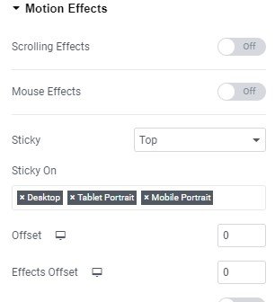
Stick this container to the top, i.e. set the Edit Container > Advanced > Motion Effects > Sticky value to “Top”.
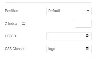
If you have a logo in the header, set their CSS class to “logo”. You can do this in Edit Image > Advanced > Layout > CSS Classes.
II Enter the JS Code
To create a Shrinking Sticky Header With Elementor Pro, you need to enter and activate a small piece of JS code. There will be no need to change this JS code if you later change the header parameters (e.g. height). You just need to put this code, as it is, on the header you are creating. The JS code is entered via the option WP Dashboard > Elementor > Custom Code > Add New. You should give that code snippet a name of your choice (I called it, not at all original, “Sticky header Shrink”), and when entering it, set the Location: Head and Priority: 1
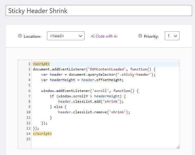
The code you enter this way is the following:
<script>
document.addEventListener('DOMContentLoaded', function() {
  var header = document.querySelector('.sticky-header');
  var headerHeight = header.offsetHeight;

  window.addEventListener('scroll', function() {
    if (window.scrollY > headerHeight) {
      header.classList.add('shrink');
    } else {
      header.classList.remove('shrink');
    }
  });
});
</script>
In the second step, choose to apply the code to the entire site (“Entire Site” option).
III Enter the CSS Code
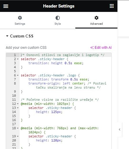
In addition to JS code, creating a Shrinking Sticky Header With Elementor Pro also requires some CSS code. The CSS code is entered through the Header Settings (lower left icon in the Elementor editor, when you edit the Header).
When you enter the Header settings, select the option Advanced > Custom CSS. Enter the custom CSS code there.
IV CSS Code Content
The code I will enter is the following:
/* Basic styles for header and logo */
selector .sticky-header {
  transition: height 0.5s ease;
}

selector .sticky-header .logo {
  transition: transform 0.5s ease;
  transform-origin: left center; /* Set the scaling point to the left */
}

/* Starting heights for different devices */
@media (min-width: 1025px) {
  selector .sticky-header {
    height: 125px;
  }
}

@media (min-width: 768px) and (max-width: 1024px) {
  selector .sticky-header {
    height: 120px;
  }
}

@media (max-width: 767px) {
  selector .sticky-header {
    height: 90px;
  }
}

/* Reduced heights when scrolling */
@media (min-width: 1025px) {
  selector .sticky-header.shrink {
    height: 95px; /* 75% of 125px */
  }
}

@media (min-width: 768px) and (max-width: 1024px) {
  .sticky-header.shrink {
    height: 85px; /* 75% of 120px */
  }
}

@media (max-width: 767px) {
  selector .sticky-header.shrink {
    height: 65px; /* 75% of 90px */
  }
}

/* Reduced logo size when scrolling */
selector .sticky-header.shrink .logo {
  transform: scale(0.7);
}
I assume you know something about CSS commands, so you will be able to follow the explanation and make the desired changes. The gist of this code is as follows:
- The length of the transformation for the height of the header and the size of the logo is half (0.5) seconds. You can of course change these values.
- The logo shrinks to the left (transform-origin: left center). This is a convenient solution if the logo is on the left side of the header, which is a common practice. If this solution does not suit you, you can change it. The default value, if this line is removed, is that the logo shrinks towards the (own) center.
- The initial height determined for the header is different for desktop, tablet, and mobile views. I set these values to 125px, 120px, and 90px respectively, and you can set the initial values that suit you.
- The header is then assigned a reduced final height after scrolling, also individually for desktop, tablet, and mobile views. I set them to be 95px, 85px, and 65px (roughly 75% of the starting height) – and you can do it differently.
- Finally, the size of the logo is reduced to 70% of the initial value (transform: scale(0.7)), which you can also change according to your needs.
As you can see, the code is simple, clear, easy to customize, and treats different screen types separately.
V Test everything and make additional adjustments if necessary
Save all these changes, reload the site, and test the behavior of the header. You probably won’t be completely satisfied right away and will need to make some additional adjustments. Play around, changing things until you’re happy with the result.
In this example, with the above code, collapsing the header when scrolling looks like this (the screenshot is for desktop view):

Details about the project for which this customized solution was developed can be found on the blog, in the article FlexRICAN –
Custom types, fields, and taxonomies that make the difference.